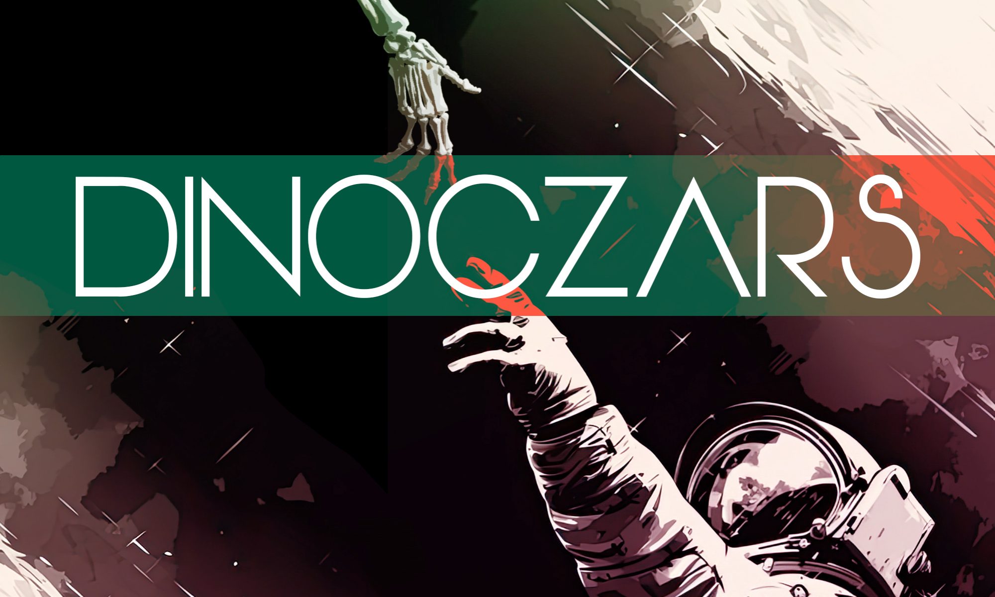

Long ago, before I wrote out Dinoczars as a novel, it was going to be a comic book. And it would’ve been spectacular … had it ever gotten off the ground.
Sadly, my artist Brian Quade and I fell just a touch short of the multi-book arc we originally conceived. We created six pages.
In retrospect, it makes sense. Creating a comic book (especially for the first time) is really hard. It takes time and effort, not to mention sustained focus over a long period of time, and if you ever do manage to land the plane, there’s a very slim chance of selling it to an established publisher. It’s a long shot.
So, after those first six pages, the project fell apart and was set on the shelf for several years until I finally just wanted to stop thinking about it and decided to write it out, in long form. And I’m very glad I did.
But, as a fun time capsule, this is a post I wrote over a decade ago about how a single page of the comic book (that never was) came together—from sketch to polished page. Enjoy!
ORIGINALLY PUBLISHED: August 7, 2012.
As you can probably guess, creating a comic book takes a significant amount of time. In fact, to create even a single page, Brian and I spend hours refining the design, drawing it out, inking it in, scanning it, coloring it, and then finally adding the digital text and formatting for final presentation.
In this post, I’ll walk you through the basic process we used to develop one of my favorite pages of Dinoczars… Page 3.
Step One: Thumbnail!
It all starts with a basic concept and a rough sketch which is often called a thumbnail due to it’s smaller size and the quick time one takes to draw it.
 Page 3, Version 1
As you can see, this is very rough. I worked this up to help Brian see the script I had written in the same visual language I was seeing it in my head. A thumbnail is also valuable as a layout tool. In western comics, ideally the viewer moves seamlessly through the page from top left to bottom right (usually) as the story moves to the next page. Some layout designs make this process easy and fluid, others get the reader lost or confused about which panel comes next.
I have always been a fan of large horizontal panels. They feel like a movie to me and I really like the framing they create, especially for landscapes. For this page, as it really begins our comic’s story, I wanted to showcase some of our landscapes and some of our dinosaurs.
Step Two: Refinement!
After I found a layout I was happy with I wanted to take more time and really show some of the details that I wanted Brian to include.
 Page 3, Version 2
For the refined version I used grid paper to get repeatable sizing and layout lines. I also added much more detail, including the narration to consider placement and sentence breaks. You can see that I kept the same images for panels one and two, but changed the framing of panel three to a lower, ground-up, perspective instead of an overhead angle.
This step is really more about me wanting to express myself visually and try to sneak some ideas into the book.
Step 3: Brian Quade!
This is where the magic really happens. This is where Brian gets to dazzle everyone.
 Page 3, Version 3
Once I’ve got the page layout down in a way I like, I give it to Brian, and he disappears for a while. When I see him, he will tell me things like “Dude, I’ve got this really great Pterodactyl framing these mountains in panel one!” I have no idea what he’s talking about because panel one is supposed to be flowers in a field, but it sounds awesome.
Then he brings it to show me, and my mind is totally blown away. He takes my little idea and brings it to life in ways I literally can’t imagine. He crafted panel one completely from scratch, in panel two, he added a split-level perspective (half above and half below the water line) to add depth, and in panel three, he followed my design almost exactly, but brought these Hadrosaurs to life!
I still am totally amazed at this page.
Step 4: Colors!
Once Brian is done, we scan the page and I begin to color it in Photoshop and add the digital text.
 Page 3, Version 4
I really love this part of the process. Trying to find a way to make each panel work on its own and as a part of the larger page as a whole is really challenging.
Knowing that this page is all about introducing the world of Dinoczars to our reader, I wanted to really open up the visual dynamics of our environments and animals so I leaned pretty heavy on the primary colors yellow, blue and red. My goal was to use strong colors early on… If a reader can accept a yellowish orange Pterodactyl or a red to grey Hadrosaur now, than later on we could color our dinosaurs almost any way we wanted and everyone would be okay with it.
Also note that I changed the narration box in panel two to the left because I didn’t want t cover up Brian’s awesome fish!
That’s pretty much it. This is the step-by-step process that we used for the first 6 pages of Dinoczars. After those first 6, though, the process has been refined considerably. I will post about those pages later, once we have actually released those pages…
We wouldn’t want to spoil the story, would we?!?!?
